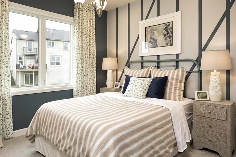
There was a time when an interior designer’s go-to neutral was beige, but those times have changed. Today’s neutrals are far more exciting and versatile than oh-so-boring beige, although I have to admit I’ve been drawn to some modern beige hues. From the look of many new home designs, gray appears to be the new beige, popping up on everything from walls and cabinetry to flooring, furniture and accents. But neutrals are not limited to beige or gray; nope, they run the gamut from white to black and everything in between. After learning more about today’s new neutrals, I wouldn’t be surprised if you’re suddenly hit with a desire to visit the paint counter at your local hardware store.
Defining Neutral
First things first, what exactly do we mean by neutral colors? In broad terms, neutrals are light to medium colors that work well with other colors. They’re the background colors. The colors that sort of recede from sight and don’t totally register with us, but are there, playing a supporting role in the room’s color scheme and feel.
“Goes with everything,” “blends,” “complements,” “timeless” — these are all terms you’ll hear associated with neutrals and for the most part they are accurate. The problem is there’s also a tendency to associate “neutral” with “blah.” If the term is forever associated in your mind with the less-than-exciting off-white or beige wall color of your first junky apartment, it’s time to change your thinking! Neutrals are an essential component of home decorating that can be used to:
- Complement or tone down vibrant colors
- Make small areas feel larger
- Make warm areas feel cooler and vice versa
- Enhance the colors of the room or pull a room together
Modern Neutrals
Neutrals remain so popular and effective because they are so necessary. Our visual senses would be overwhelmed if we didn’t have some neutral tones to balance out bolder colors. But don’t think that just because you need a neutral you have to go with a beige or white color. Today’s neutral color options are seemingly endless and work in just about any space. Expand your neutral color horizons by considering any of the following modern neutrals:
Whites and Off-Whites
Whites, off-whites, eggshells … they will always have a place in the neutral color list because white isn’t just white anymore. Subtle shade and hue differences mean white neutrals can support just about any other color without detracting from it or appearing too stark.
Taupes and Beige
Yes, beige is still on the list, but this is not the beige you remember. Today’s modern taupe and beige colors have a range of undertones that can be warm and soothing or cool and crisp, depending on the effect you’re trying to create. They pair well with dark wood and even gray.
Grays
Grays are top of the list as far as new neutrals go. I guarantee you’ll be overwhelmed by all of the gray color options you’ll find in the paint store. Gray is a great choice for those who are not quite ready to give up on beige or white but want something that is more modern.
Mauves and Lilacs
Yes, we put pinks and purples on the list! Oh, excuse me, I mean mauve and lilac. These two colors are incredibly versatile when presented in barely-there shades. They can help create soothing, serene environments and work well with dark wood molding or flooring as well as the ever-popular grays and whites.
Blues and Greens
Homes that are inspired by nature or have lots of windows do well with blues and greens as neutral bases. These colors are naturally soothing, allow the home to blend seamlessly with the outdoors, and are especially popular in coastal homes and cottages.
Browns and Reds
If you’re going for earthy and warm, you cannot go wrong with browns and reds. Though they can be considered neutral, they are dramatic neutrals. You’ll want to be careful that they do not overwhelm a room, but with the right theme or décor such as Asian- or Spanish-inspired, they are eye-popping.
How to Use Neutrals
So many neutrals, so little space! How can you possibly incorporate all of these fantastic new neutral color options into one home? Think walls, definitely, but also ceilings, floors and accents. No one said your neutral colors have to be stuck on the wall. In fact, experts recommend thinking beyond the wall when decorating with neutrals. Designer Laura Burleson of Laura Burleson Interiors in Tallahassee, Florida, says: “Try it in unexpected applications — the ceiling of a moody, masculine library; the interior of creamy cabinetry in a kitchen.”
Laura Muller, principal of Four Point Design Build Inc. in Canoga Park, California, adds: “Layering is a great way to add a little excitement to a neutral palette. Consider texture, patterns and slight variations in tone. Use a variety of textures from flannels to cheneilles and don’t be afraid to throw in some sparkle. Just keep the tones similar and it will all work.”
Now, head to the paint counter and start exploring your newly expanded world of neutrals!

Liyya Hassanali is a Project Manager and Content Strategist for Kinship Design Marketing, a boutique agency that provides marketing strategies and content for architects, interior designers, and landscape designers. She is a 15+ year veteran of the marketing and advertising industry, working closely with her clients to provide written content that meets their marketing goals and gets results.
Liyya is passionate about home design and décor and is a confessed HGTV and Pinterest addict. When not providing content writing services for her clients, she can be found browsing home décor sites or spending time with her family.

 Forget Man Caves, We All Need Me Spaces